Getting Started with Effect UI
Overview
Our SwiftUI Components Library provides a collection of reusable components that can easily be integrated into your iOS projects. Each component is designed to be flexible, customizable, and easy to use, making it ideal for enhancing your app's user interface.
Usage Options
There are several ways to use the components from our library in your project. You can choose the method that best suits your needs and workflow.
1. Copy-Paste Components
Each component in our library is a standalone file. You can copy-paste individual components directly into your project. These components are designed to work independently, but you can also combine them with other components to create complex UI elements.
Steps to Copy-Paste Components:
Head over to our Components Page and select the component you want to use. Each component page contains detailed information, code snippets, and examples to help you get started.
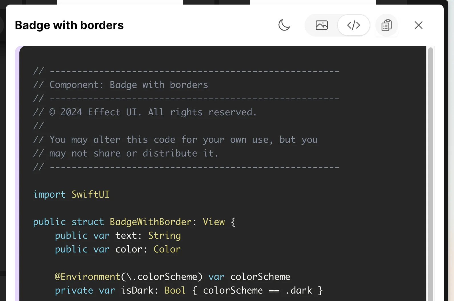
2. Import All Components
Note: This option is currently under development and will be available soon.
To import all components from the library into your project, you can download the library and add it directly to your
project. This method allows you to access all components without needing to copy-paste them individually.
Doing so will add all components to your project, which you won't have to import using the Swift import statement.
This method provides you with the most flexibility and ease of use, as you can access any component directly in your project. You can also customize the components to suit your app's design requirements.
Steps to Import the Library:
- Download the Library: Visit our Downloads Page and download the latest version of the library.
- Add to Your Project:
- Unzip the downloaded file.
- Copy the
Componentsfolder fromEffectUI/Sourcesand paste it into your project. - Make sure to add the folder to your project's target.
- You can now access the components directly in your project without needing to import them individually.
- Use the Components:
- After adding the components to your project, you can use them in your SwiftUI views as needed.
- The components are designed to be flexible and customizable, allowing you to tailor them to your app's design.
3. Import the Full Library as a Package
Note: This option is currently under development and will be available soon.
For a more streamlined experience, you can import the entire library into your project. This allows you to access all the components without needing to copy-paste them individually.
We have tailored the components to have an easy-to-use API, which allows you to configure them to your liking.
Steps to Import the Library:
-
Download the Library: Visit our Downloads Page and download the latest version of the library.
-
Add to Your Project:
- Unzip the downloaded file.
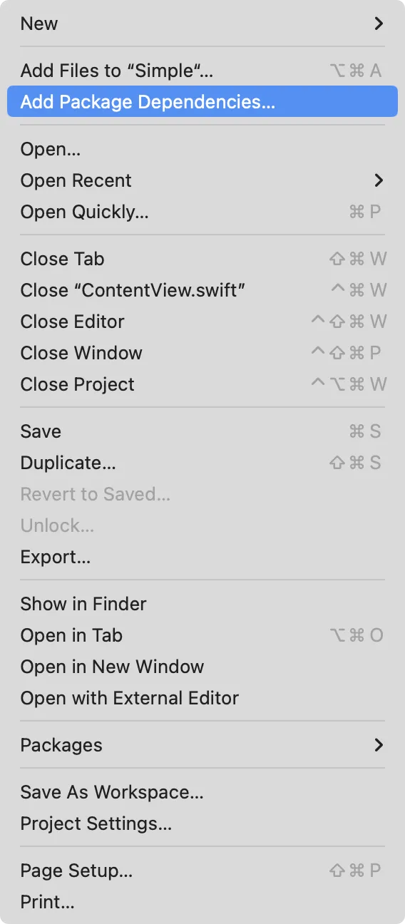
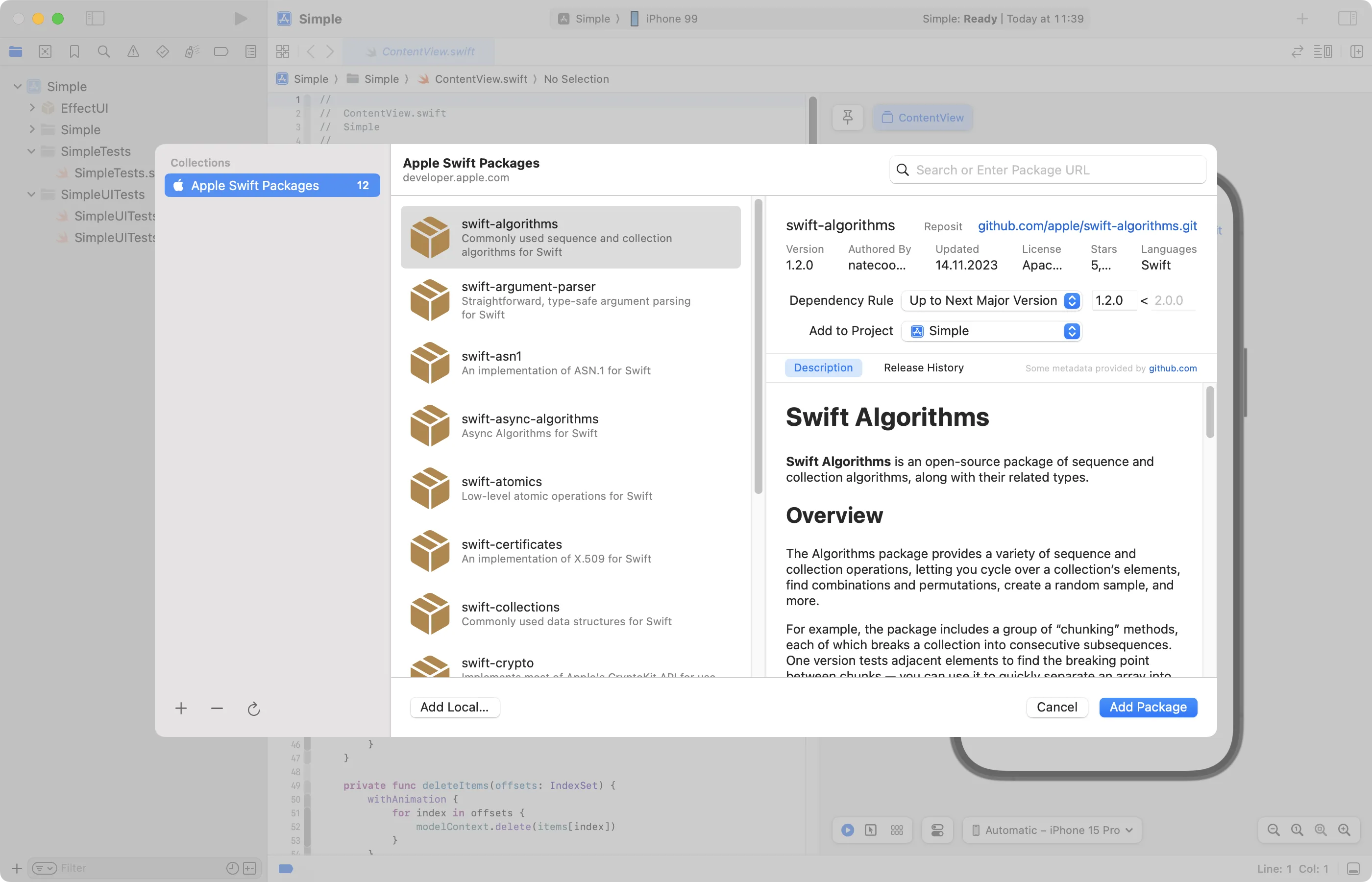
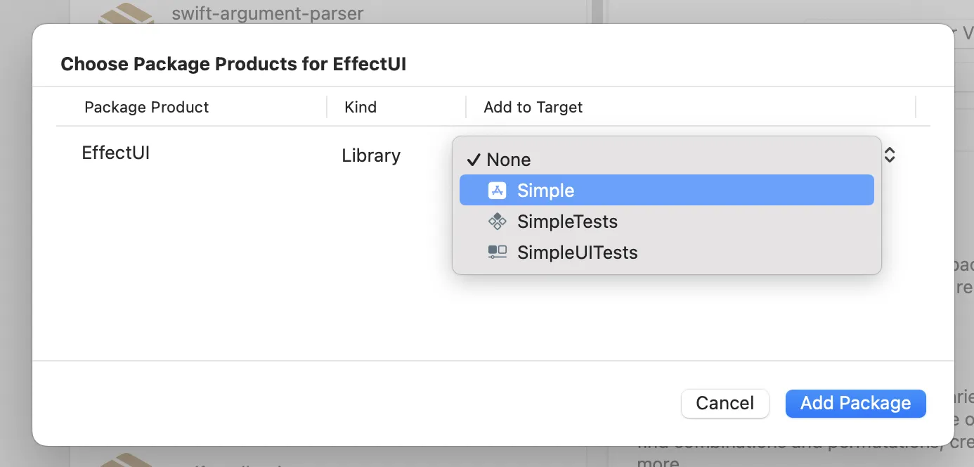
- In Xcode, add the
EffectUIfolder to your project by selectingFile > Add Package Dependenciesand importing the folder as a local package. - Make sure to add the package to your project's target.
-
Import the Library Namespace:
Add the following import statement to the files where you want to use the components:
import EffectUI
- Use the Components:
After importing, you can use any of the components available in the library. They can be customized to suit your specific needs.
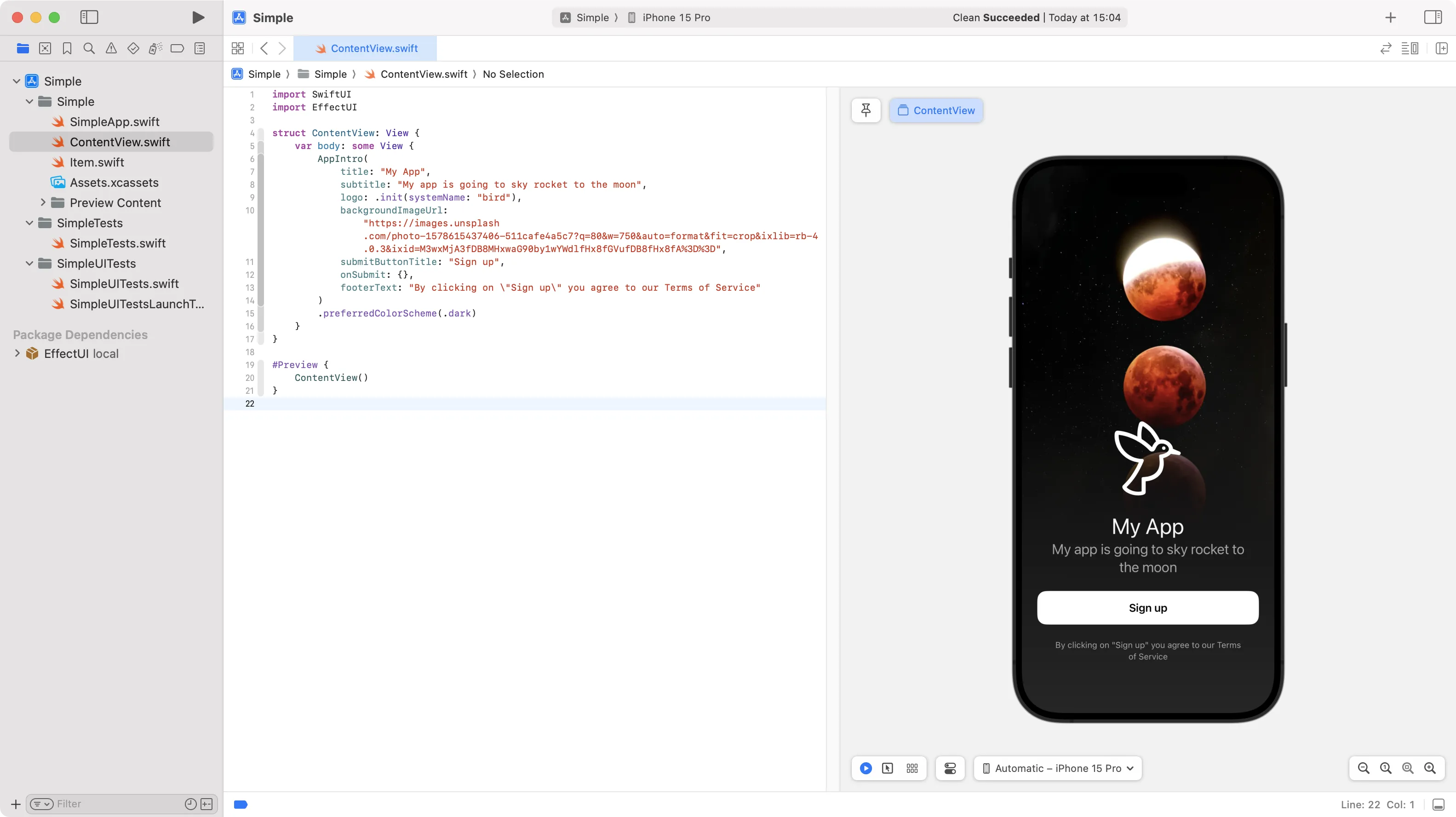
Example Usage
import SwiftUI
import EffectUI

struct ContentView: View {
    var body: some View {
        AppIntro(
            title: "My App",
            subtitle: "My app is going to sky rocket to the moon",
            logo: .init(systemName: "bird"),
            backgroundImageUrl: "https://images.unsplash.com/photo-1578615437406-511cafe4a5c7?q=80&w=750&auto=format&fit=crop&ixlib=rb-4.0.3&ixid=M3wxMjA3fDB8MHxwaG90by1wYWdlfHx8fGVufDB8fHx8fA%3D%3D",
            submitButtonTitle: "Sign up",
            onSubmit: {},
            footerText: "By clicking on \"Sign up\" you agree to our Terms of Service"
        )
        .preferredColorScheme(.dark)
    }
}

#Preview {
    ContentView()
}
Output:
Requirements
- iOS Version: The library requires iOS 17 or later. Support for earlier versions may be added in future updates. Most of the components are designed to work with the latest iOS features and APIs. There are however some components that may work with earlier versions as well.
Updates
We are committed to improving our library by adding new components and features regularly. Stay up-to-date with the latest releases by visiting our Components Page.
Why Choose Our Library?
1. Time-Saving
Our library offers ready-made components that can significantly reduce development time. Instead of building common UI elements from scratch, you can simply integrate our components into your project, allowing you to focus on the unique aspects of your app.
2. High Customizability
Each component is built with flexibility in mind. Whether you need to adjust colors, sizes, layouts, or behaviors, our components can be easily customized to meet your specific design requirements.
3. Consistent Design
By using our library, you ensure that your app maintains a consistent design language throughout. This not only improves the user experience but also aligns with the latest iOS design standards.
4. Regular Updates
We continuously update the library with new components, improvements, and bug fixes. This means you'll always have access to the latest UI trends and enhancements without needing to reinvent the wheel.
5. Ease of Use
Our components are designed to be intuitive and easy to implement, even for developers who are new to SwiftUI. Each component comes with a Demo component that provides examples to help you get started quickly.
FAQ
1. What iOS versions are supported?
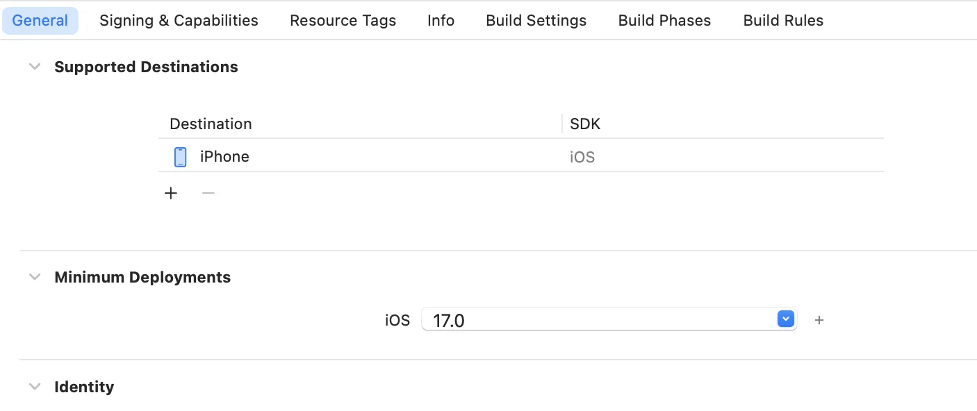
Our library is designed to work with iOS 17 and later versions. To make sure
that you are on the latest version of iOS, you can check the platform version in the ios section of your Podfile
file. You can also check the version of iOS that you are using by going to the project settings in Xcode.
2. How do I customize a component?
Each component comes with a set of properties that you can modify to fit your design. You can refer to the documentation provided with each component for specific customization options.
3. Can I use multiple components together?
Yes, our components are designed to work both independently and in combination with one another. You can mix and match components to create more complex UI elements.
4. How do I stay updated with the latest components?
We regularly release updates on our Downloads Page. You can check there for new components, features, and improvements.
5. What should I do if I encounter an issue?
If you experience any problems or have questions, feel free to contact our support team at [email protected]. We’re here to help!
6. Can I contribute to the library?
We welcome contributions from the community. If you have a component or feature you'd like to add, please reach out to us at [email protected].
7. Is the library free to use?
Some components are free to use, while others may require a license. Please refer to the licensing information provided at License for more details.
8. Where can I get the package?
After purchasing the Effect UI library here, you can download the package from the Downloads Page. We have two package options available: personal and teams. Choose the one that best suits your needs.
Support
If you encounter any issues or have questions, please reach out to our support team at [email protected].
Our mission
Effect UI for
your next project
We are a team of talented designers making iOS components to help developers build outstanding apps faster with less effort and best design.